
Mastering Candlestick Chart Patterns: A Beginner's Guide
Mastering Candlestick Chart Patterns: A Beginner's Guide to Trading
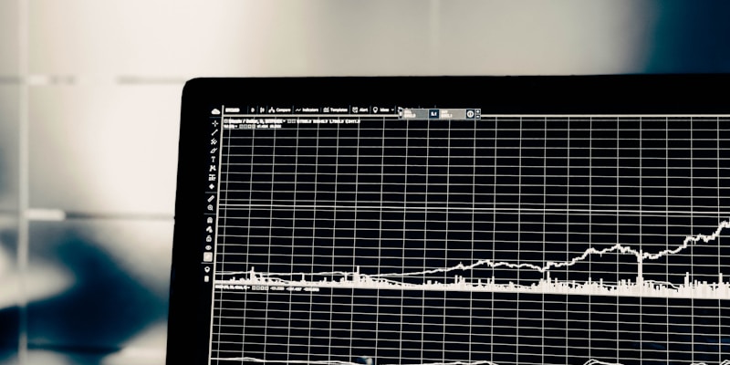
In the fast-paced world of stock trading, the ability to quickly interpret market sentiment can be the difference between a winning trade and a missed opportunity. While many beginners start by looking at simple line charts for companies like Apple Inc., professional traders often rely on a much more descriptive tool: the candlestick chart.
Originally developed by Japanese rice traders in the 18th century, candlestick charts provide a visual representation of price action that tells a story of the battle between buyers (bulls) and sellers (bears). In this guide, we will break down the fundamentals of candlestick patterns, how to read them, and how you can use them to enhance your strategy on Stockinhood.
What is a Candlestick Chart?
A candlestick chart is a style of financial chart used to describe price movements of a security, derivative, or currency. Each 'candle' typically represents a specific time frame—whether it is one minute, one hour, or one day.
Unlike a line chart, which only shows the closing price, a single candlestick provides four critical pieces of data:
- Open: The price at which the stock started trading during the period.
- High: The highest price reached during the period.
- Low: The lowest price reached during the period.
- Close: The final price at which the stock traded when the period ended.
The Anatomy of a Candlestick
To understand patterns, you must first understand the two main parts of a single candle:
1. The Real Body
The wide part of the candle is called the 'real body.' It represents the range between the opening and closing prices.
- If the close is higher than the open, the body is usually green (or white), indicating bullish sentiment.
- If the close is lower than the open, the body is usually red (or black), indicating bearish sentiment.
2. The Wicks (Shadows)
The thin lines poking out from the top and bottom of the body are called wicks or shadows.
- The upper wick represents the highest price of the session.
- The lower wick represents the lowest price of the session.
Essential Bullish Reversal Patterns
Bullish patterns suggest that a downtrend may be coming to an end and that the price might start heading upward. These are often looked for when a stock like Microsoft Corp. has undergone a recent correction.
The Hammer
A Hammer occurs at the bottom of a downtrend. It has a small body at the top and a long lower wick (at least twice the size of the body). This signifies that while sellers pushed the price down, buyers stepped in aggressively to drive it back up near the open.
Bullish Engulfing
This is a two-candle pattern. The first candle is a small red candle, followed by a much larger green candle that completely 'engulfs' the previous day's body. This indicates a massive shift in momentum. You might see this pattern occur in NVIDIA after a period of consolidation before a major breakout.
Essential Bearish Reversal Patterns
Bearish patterns suggest that an uptrend is losing steam and a price drop may be imminent.
The Shooting Star
The inverse of a Hammer, the Shooting Star appears at the top of an uptrend. It has a small body at the bottom and a long upper wick. This shows that buyers tried to push the price higher, but were met with significant selling pressure, causing the price to retreat. If you see this on a chart for Tesla after a parabolic move, it could be a sign to tighten your stop-losses.
Bearish Engulfing
This occurs when a small green candle is followed by a large red candle that completely covers the previous candle's body. It signals that the bears have successfully seized control from the bulls.
The Doji: A Sign of Indecision
A Doji is a unique candle where the open and close prices are virtually identical. The candle looks like a cross or a plus sign. A Doji represents a tug-of-war where neither side wins. While a Doji isn't a reversal signal on its own, it often precedes a change in trend. For example, if Amazon has been climbing for ten days straight and suddenly forms a Doji, it suggests the trend is exhausting.
Practical Tips for Using Candlesticks
- Context is King: Never trade a pattern in isolation. A Hammer at the top of an uptrend is not a bullish signal; it must occur after a downtrend to be valid.
- Confirm with Volume: A reversal pattern accompanied by high trading volume is much more reliable than one on low volume.
- Use Multiple Timeframes: A pattern might look bullish on a 15-minute chart but bearish on a daily chart. Always look at the bigger picture.
- Combine with AI Insights: At Stockinhood, we use AI to identify these patterns automatically across thousands of stocks, helping you filter out the noise.
Summary and Key Takeaways
- Candlestick charts offer a much deeper look into market psychology than line charts.
- Green candles represent buying pressure; red candles represent selling pressure.
- Look for Hammer and Bullish Engulfing patterns to spot potential entries.
- Watch for Shooting Stars and Bearish Engulfing patterns to identify potential exits.
- Dojis signal market indecision and a potential trend pause.
By mastering these visual cues, you can begin to 'read' the market rather than just guessing. Technical analysis is a skill that takes time to develop, but understanding candlesticks is the foundational first step for any serious investor.
Disclaimer: The information provided in this article is for educational and informational purposes only and should not be construed as financial or investment advice. Trading stocks involves significant risk, and it is possible to lose your entire investment. Always conduct your own research or consult with a qualified financial advisor before making any investment decisions. Stockinhood and its affiliates do not guarantee the accuracy or completeness of the information provided herein.
Stockinhood AI
AI-Generated Content
Disclaimer: This article is for informational and educational purposes only and does not constitute financial advice. All AI-generated content should be independently verified. Past performance does not guarantee future results. Consult a licensed financial advisor before making investment decisions.
Related Articles


Ready to dive deeper?
Explore AI-powered stock analysis and market research tools.
Explore Stockinhood